Monday, November 8, 2010

Modernism/ Modern Movement/ New York School

-1940s
- Intuitive design/ less structured compared to European design 
-More informal with organizing space
- American approach to European modern design

http://blog.masslive.com/bayroadphoto/2009/02/large_Obama%20Poster_Hobb.jpg
http://www.vam.ac.uk/vastatic/microsites/1331_modernism/files/45/17_gispen_poster.jpg

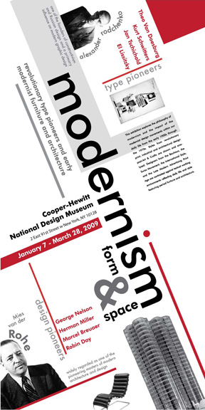
http://www.sito.org/id/umc/Modernism_poster_final.jpg

International Typographic Style

-1950-1970
-Clarity of design objective
-Grid Format 
-Visual Unity of design through asymmetrical organization through a mathematically organized grid 
- Predominant Use of Sans-Serif expresses spirit of progressive age

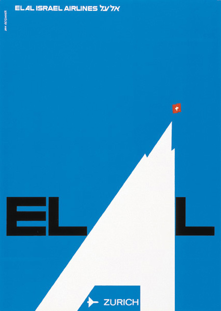
http://www.aisleone.net/wp-content/uploads/2010/03/dan-reisinger-el-al-poster.jpg
http://img3.visualizeus.com/thumbs/10/09/03/graphic,design,international,typographic,style,japanese,poster,print-da5eeb6c0dec8e06bd969753da7a055c_m.jpg
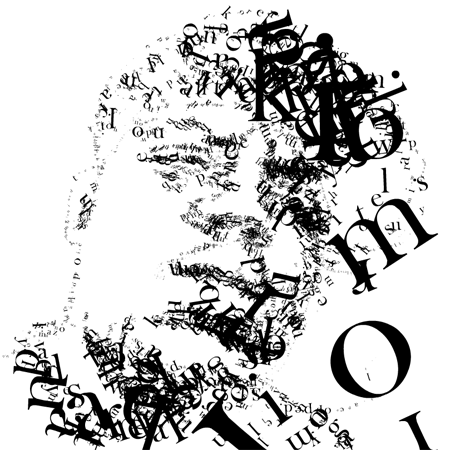
http://sarahndipity.files.wordpress.com/2007/06/lihfv.png

Art Deco

-1920-1930
-Straight Lines 
-Flat, geometric, constructed shapes
-Chevrons, zigzags, lightning bolts

http://farm5.static.flickr.com/4007/4386203728_27b08f38a8.jpg
http://www.crudedoodle.com/images/School%20Projects%20Buttons/rocketeer2-poster.png
http://artdeco.antique-marks.com/images/art-deco-poster.jpg

Constructivism

-Organization of abstract, geometrical elements to make dynamic or visually stable forms
-Combination of different sans serif typefaces for their visual and formal properties as well as their literal     meanings
-Simple, flat, symbolic colors
-Extensive white space as part of the design
-Photography (rather than drawn illustrations) and photo montage

http://www.cultureclod.com/wp-content/gallery/construct/x26383_lg.jpg
http://www.kimsoncom.com/images/Constructivism_Poster.jpg


http://blog.ardes.com/assets/2009/1/6/constructivism_poster.jpg

Bauhaus

-1920s
-"Form follows functions ": the aesthetic of the Modern Era
-The threes principles of Bauhaus design were:
-Form follows function
-Economy of form 
-Truth to materials

http://imagecache6.allposters.com/LRG/19/1920/TNU9D00Z.jpg
http://www.movieposter.com/posters/archive/main/42/MPW-21244
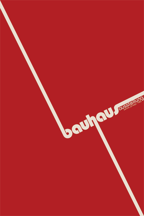
http://www.vincentschunk.com/images/portfolio/posters/bauhaus.gif

Monday, October 25, 2010

Essay For Project 2

     For project 2, we had to design the BCC General Catalog for 2010 to 2012. The goal for this project is to visual communicate the college mission statement and appropriate engage the audience. For the project we were required to use the BCC logo, Images of People, the title: "General Catalog 2010-2012," and the mission statement: "This is Your College." We were also required to continue using the design principles: emphasis, alignment, contrast, balance, flow, and repetition. 
      Emphasis is on the "This is your college;" from there your eye goes to the curved line of photo's, this is where flow is used. Alignment is used next, with the images fixing perfectly inside the frames. Repetition is used by repeating the images that were placed on the page. Some the images on the page are larger then others, this helps create contrast between images. Next your eye then moves to the title of the design: "General Course Catalog 2010-2012." This is when balance was used by glowing the letters equally. In this design I used photo's that represented the Broome Community College and what  the goals of the college are. I believe that my design is visually appealing and that it fits the design criteria necessary for this assignment.