Tuesday, December 7, 2010

Monday, December 6, 2010
History Poster Write Up
My history poster uses a Modern style. My poster teaches the viewer a brief history of the Major League Baseball Team, the New York Yankees. My poster follows the years from 1996 to 2009. During these years the New York Yankees have captured 5 world series championships, my poster helps capture theses different moments in time. My design uses the rule of thirds as well as all the essential principles of design. Emphasis is used in the title "The History of New York Yankees," alignment is used with the text. The bullet like text and use of photos create flow and repetition. Contrast is used wen I lighted up the Yankees logo so the viewer can see the text, and balance is all throughout the design from the logo to the tag line. Color and typography play a huge role in expressing my design and getting the overall feel for the poster.
Thursday, December 2, 2010

Thursday, November 18, 2010


Tuesday, November 16, 2010

Wednesday, November 10, 2010
How
- The New York Yankees have won over 27 World Championship.
- Which is the most championships ever won by any franchise.
- The long time owner of the Yankees was George Steinbrenner, in which he owned for 1973 until his death in July 2010
- The ownership of the Yankees was passed on to his sons Hal and Hank Steinbrenner
- During the time period from 1996 to 2000 the New York Yankees won 3 out 4 years, putting themselves as the first dynasty in decades.
- During this period the Yankees were managed by Joe Torre, who was with the franchise for 12 seasons and won 4 World Championships, and made the playoffs each year he managed.
- In 2008 Joe Torre was released from the Yankees and was replaced by a form Yankees catcher Joe Girardi
- It took Girardi his second season in New York to lead the Yankees to their 27th World Championship.
Monday, November 8, 2010
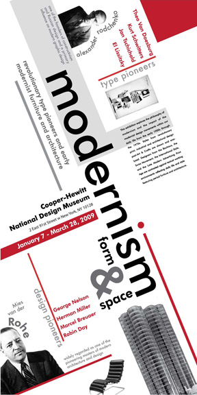
Modernism/ Modern Movement/ New York School
-1940s
- Intuitive design/ less structured compared to European design
-More informal with organizing space
- American approach to European modern design


International Typographic Style
-1950-1970
-Clarity of design objective
-Grid Format
-Visual Unity of design through asymmetrical organization through a mathematically organized grid
- Predominant Use of Sans-Serif expresses spirit of progressive age

Art Deco
-1920-1930
-Straight Lines
-Flat, geometric, constructed shapes
-Chevrons, zigzags, lightning bolts


Constructivism
-Organization of abstract, geometrical elements to make dynamic or visually stable forms
-Combination of different sans serif typefaces for their visual and formal properties as well as their literal meanings
-Simple, flat, symbolic colors
-Extensive white space as part of the design
-Photography (rather than drawn illustrations) and photo montage


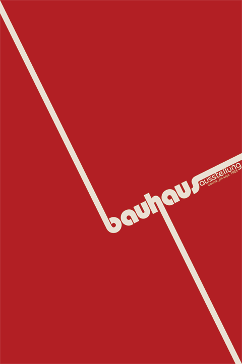
Bauhaus
-1920s
-"Form follows functions ": the aesthetic of the Modern Era
-The threes principles of Bauhaus design were:
-Form follows function
-Economy of form
-Truth to materials

Thursday, November 4, 2010
Monday, October 25, 2010
Essay For Project 2
For project 2, we had to design the BCC General Catalog for 2010 to 2012. The goal for this project is to visual communicate the college mission statement and appropriate engage the audience. For the project we were required to use the BCC logo, Images of People, the title: "General Catalog 2010-2012," and the mission statement: "This is Your College." We were also required to continue using the design principles: emphasis, alignment, contrast, balance, flow, and repetition.
Emphasis is on the "This is your college;" from there your eye goes to the curved line of photo's, this is where flow is used. Alignment is used next, with the images fixing perfectly inside the frames. Repetition is used by repeating the images that were placed on the page. Some the images on the page are larger then others, this helps create contrast between images. Next your eye then moves to the title of the design: "General Course Catalog 2010-2012." This is when balance was used by glowing the letters equally. In this design I used photo's that represented the Broome Community College and what the goals of the college are. I believe that my design is visually appealing and that it fits the design criteria necessary for this assignment.
Emphasis is on the "This is your college;" from there your eye goes to the curved line of photo's, this is where flow is used. Alignment is used next, with the images fixing perfectly inside the frames. Repetition is used by repeating the images that were placed on the page. Some the images on the page are larger then others, this helps create contrast between images. Next your eye then moves to the title of the design: "General Course Catalog 2010-2012." This is when balance was used by glowing the letters equally. In this design I used photo's that represented the Broome Community College and what the goals of the college are. I believe that my design is visually appealing and that it fits the design criteria necessary for this assignment.
Thursday, October 21, 2010

Thursday, October 7, 2010

Wednesday, October 6, 2010


Wednesday, September 15, 2010
Project Write Up
For Art 125 project number one, we used design principles: Emphasis, Contrast, Repetition, Alignment, Balance, and Flow to create and eye catching unified design. I created the word Emphasis with bold font and with a drop shadow. I used about 180 font with an arch that makes it look like its popping out at your eyes. I believe that this will automatically force the viewer to go to the that word as soon as you look at the page. The second word I wanted the viewer to notice is the word Repetition. The word Repetition is repeated several times with behind the word Emphasis. I used another bold type font with all upper cased letters and strategically place the word behind Emphasis so that the viewer will auto look at Repetition next. Third I want the viewer to go to the word Flow by placing it below Repetition and Emphasis. The wave font and gray to black lettering always the viewer to get a sense of movement. I think that way I set up Flow makes the eye down the page to Alignment. Alignment is very eye catching bye the black and gray letters. Next I wanted the viewer to notice the word Contrast.This word is also very eye catchy and I made it so the word looks like it is bending around the corner of the page. I also faded out the word so that the viewers eyes move one to the last word Balance. The word Balance has all bold font an enlarge letter "A" which helps the word stand out as well as look flashy. The gray background also helps the letters stand out and be more revealing.


Subscribe to:
Posts (Atom)